Move to Gutenberg editor.
Kaleidalabsは Automatic のWordPress.com上でプレミアムプランで運用しています。
Kaleidalabs is running on Automatic’s WordPress.com on a premium plan.
クラシックエディタを諦めてGutenbergへの移行
Giving up the classic editor and moving to Gutenberg
wordpressは古いテキスト形式のクラシックエディタから、ビジュアルライクに記事を作れるGutenberg を結構前から用意していました。
ブロック記法と呼ばれるこの手法に馴染めず従来のクラシックエディタを使い、必要に応じてHTMLタグを入れて便利に使っていましたが、それとの別れを決断しました。
- Automaticによるクラシックエディタが2022年末で終了 (結果的に2024年に延長されました)
- 新しいテーマへの対応が出来ない
これが主な理由です。
クラシックエディタの終了は大きな意味を持っていますね。嫌でも移行するしかありません。
元々クラシックエディタの終了は過去数年に渡り何度かアナウンスされては延長されてを繰り返しており、流石に2022年で終わりかなと思ったのですが、2024年へとさらに延長になった様です。12月になったら、2022年末の終了を2024年まで延ばす発表がありました。発表をギリギリまで引っ張られたのは仕方ありませんね。
ただ、いずれ終わりになるのはそのアナウンスの通りでしょう。
当所、自分的には使いにくいGutenberg への移行には積極的にはなれませんでした。やはり移行するにはもっとポジティブな理由が欲しいです。
wordpress has had Gutenberg for quite some time, which allows you to create articles in a visual-like manner, instead of the old text-based classic editor.
I was not comfortable with this method, called block notation, and used the old classic editor, adding HTML tags as needed for convenience, but I decided to part ways with it.
- The classic editor by Automatic will end at the end of 2022 (it was extended to 2024 as a result).
- Written by classic editor article is not support new themes.
This is the main reason.
First, the end of the classic editor is a big deal. We have no choice but to migrate even if we don’t want to.
Originally, the end of the classic editor was announced and extended several times over the past few years, and I thought it would end in 2022, but it seems that it has been further extended to 2024. They announced In December the end of 2022 to extended to 2024. I understand why they announced in a last-minute announcement. They want to end the classic editor, so.
However, I guess the announcement is true that it will eventually come to an end.
For the time being, I was not positive about migrating to Gutenberg, which is difficult for me to use (Maybe I write program in my work, so…). I still need a more positive reason to move to Gutenberg.
新しいテーマへの対応
Support for new themes.
New theme look like written for Gutenberg.
その理由が新しいテーマへの対応でした。
今現在使っているテーマの変更を考えており、ちょっと試したところ、思った感じにならずなんで?と思ったらどうも記事の形式がブロック記法になっていなかった事が原因だったようです。見てみると最近用意されている新しいテーマはブロック記法で書かれている事が前提の様です。
これには過去の記事の分量を考えると頭を抱えましたが、今後の事を考えるとブロック記法への移行はやむを得ないようです。諦めて移行すべき時だと感じました。
しかし、いざ始めてみると、ただ単に書き方が変わるだけでなく、生成されるHTMLとCSSのクラス名が違う事がわかりました。
そしてクラシックエディタで記入していた時と同じレイアウトにならないのです。
これは困った…再び頭を抱えました。
The reason for this was to accommodate a new theme.
I was thinking of changing the theme I am currently using, and when I tried it for test, it didn’t look the way I wanted it to. I thought it was because the articles were not formatted in block notation. I looked at the new theme that has been prepared recently, and it seems that it is assumed that the new theme is written in block notation.
This was a headache for me considering the amount of past articles, but it seems that the transition to block notation is unavoidable when considering the future. Finally I felt it was time to give up and make the transition.
However, when I started, I found that not only the writing style was different, but also the generated HTML and CSS class names were different.
And the layout was not the same as when I had filled it out in the classic editor.
This was a problem…I was once again stumped.
メンテナンスを考慮しながらCSSを工夫して対応
Respond by devising CSS while taking maintenance into consideration.
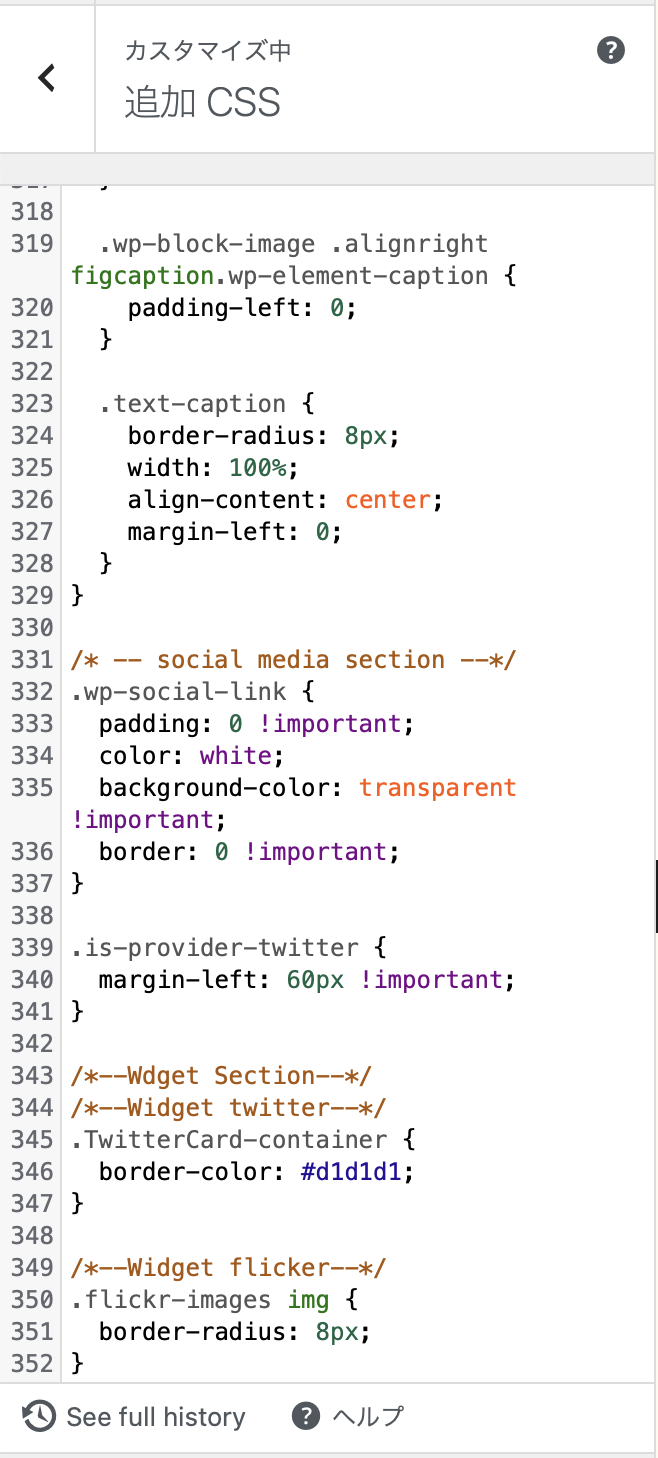
CSS editor in wordpress.
現在加入しているプレミアプランは独自CSSを当てる事が可能です。
丁度、少し前から(昨年のサイトをリニューアルする少し前から)、CSSによるレイアウト変更をちょこちょこやっていました。その時の事を踏まえて、Gutenberg により生成されたHTMLも、クラシックエディタにより生成されたHTMLと同じ表示となる様にCSSを調整しました。
調整と一言で言っても、なかなかイメージ通りにならず、特にデバイスが変わる(MacとiPhone)事でレイアウトが崩れるため、Safariのインスペクタとレスポンスシブ表示を使って修正対応を根気強く進めていました。この機能には大変助けられました。
今使ってるテーマ (Hemingway Rewritten) はレスポンシブ対応になっているので、デバイスを変えると表示状態が最適化された形で変わりますが、Macで見た時の画面レイアウトは少し工夫しているため、それを維持しつつiPhoneで見やすいレイアウトにする為には、メディアスクリーンサイズを見て対応する必要がありました。iPhoneサイズの対応を前提に横幅420pxを境に表示スタイルを調整する様CSSのメディアクエリで以下の様に指定しています。
@media screen and (max-width: 420px) {

}
縦写真をレイアウトした時にMacでは表示位置によって左右に余白を持たせていたため、以下の方法でレイアウトを寄せた時の余白を計算して、余白を作り出しています。
写真を右側にレイアウトした場合
padding-right: calc(100%-450px);写真を左側にレイアウトした場合
padding-left: calc(100% - 450px);縦写真の場合は幅450pxに指定する必要がありますが、それくらいがバランスが良さそうと思い、そこはサイズを固定しています。
こういった方法を使って問題を一個一個解決してCSSに落とし込んでいきました。
特に縦表示の写真を左右どちらかに寄せた時の調整に苦労しました。
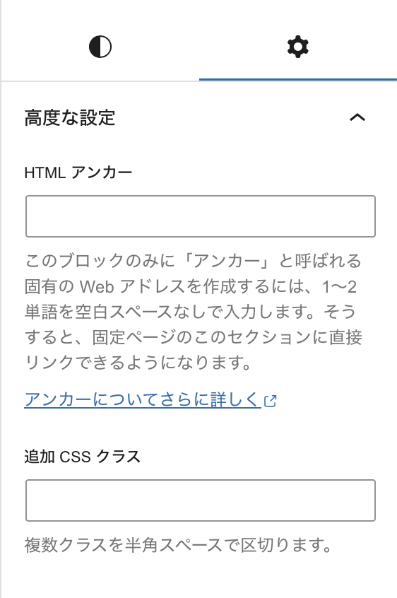
また、Gutenberg上でブロックを選んで個別でカスタムCSSのクラスをつけることも出来ますが、その方法は基本的にはやめました。いずれ、ブロックが多いページでは個別で一個一個カスタムCSS名をつけていくのは対応がめんどくさくなるからという理由です。極力、HTMLタグ内の情報や生成されたHTML、それに付随されたCSSのクラスを判別して、レイアウトが整う様に細かくCSSを記述していきました。
ブロック内でHTML記述をしなくてはいけないもののみ、CSSを指定する方法にしようかと思っています。
そして、幾つかの記事をブロック記法に変換し、中にはイメージ通りにならないケースを見つけては再度CSSを修正してという事を繰り返していました。レスポンスシブ対応するべく複数の表示サイズで確認をしながら、コツコツブロック記法による再現を進めていました。
おかげで、縦表示の写真は450pxと自分でサイズを指摘していますが、それ以外はブロック記法に変換しただけでイメージ通りに表示されているので、ブロック記法への変換の手間を最小限に留める事が出来ました。
Specify CSS in block notation way.
The Premier Plan to which we are currently subscribed allows us to apply our own CSS.
Just a little while ago (since before the renewal of the site last year), we had been doing some layout changes using CSS. Based on that time, I adjusted the CSS so that the HTML generated by Gutenberg would be displayed in the same way as the HTML generated by the classic editor.
In a word, it was not easy to adjust the CSS as I had imagined, especially since the layout was broken due to the change of devices (Mac and iPhone), so I used Safari’s Inspector and Responsive View to patiently make corrections. This feature helped me a lot.
The theme I am using now (Hemingway Rewritten) is responsive, so when I change devices, the display state changes in an optimized manner, but since the screen layout when viewed on a Mac is a bit contrived, in order to maintain that and make the layout easier to view on an iPhone, it was necessary to adjust the display style based on the size of the media screen.
@media screen and (max-width: 420px) {

}
When a vertical photo is laid out, the left and right margins are created by calculating the margins when the layout is moved closer using the following method, because in the Mac is generate the left and right margins depending on the display position.
When a photo is laid out on the right side
padding-right: calc(100%-450px);When the photo is laid out on the left side
padding-left: calc(100% - 450px);For vertical photos, I set to specify a width of 450px, but I thought that would be a good balance, so I fixed the size there.
Using these methods, we solved the problems one by one and incorporated them into the CSS.
I had a particularly difficult time adjusting the vertical photos when they were moved to the left or right.
I can also select a block on Gutenberg and add a custom CSS class to blocl by block it individually, but we have basically abandoned that method. The reason is that it will eventually become too much of a hassle to add custom CSS names one by one to pages with many blocks. We tried our best to determine the information in the HTML tags, the generated HTML, and the CSS class associated with it, and wrote the CSS in detail so that the layout would be well organized.
I am thinking of using a method of specifying CSS only for those articles that require HTML description within the block.
Then, I converted some articles to block notation, found some cases where the CSS was not as I had imagined, and modified the CSS again, and so on. I was trying to reproduce the block notation method while checking multiple display sizes in order to make it responsive.
Thanks to this, I was able to minimize the time and effort required to convert to block notation, since the photos displayed vertically are width 450px and I pointed out the size myself, but other than that, the images are displayed exactly as I imagined after converting to block notation.
Migrate article to Gutenberg over 750.
概ね変更に対応出来る形になって来たので、隙間を見つけては直近の記事や比較的人気の高い記事から順次ブロックに変換作業を地道にしています。
(全部で750記事以上あり長い旅になりそうです)
ただ、頑張ってブロック記法に変更しても直接的にはSEOの効果はなさそうで、そこも含まれてたらもっとやる気は出たなぁというのが正直なところです、笑。
とにかく地道に変換を続けていこうと思います。
I am now able to cope with most of the changes, so I am steadily converting the most recent articles and relatively popular articles to block notation as I find gaps in the work.
(There are over 750 articles in total, so it will be a long journey.)
However, it seems that there is no direct SEO effect even if I try my best to change to block notation, and I honestly think I would have been more motivated if I had included that part, lol.
Anyway, I will continue to convert steadily.
 Kaleidalabs